Customizing Appearance
The bottom sheet consists of below elements, which you can style as you want, and give custom class names.
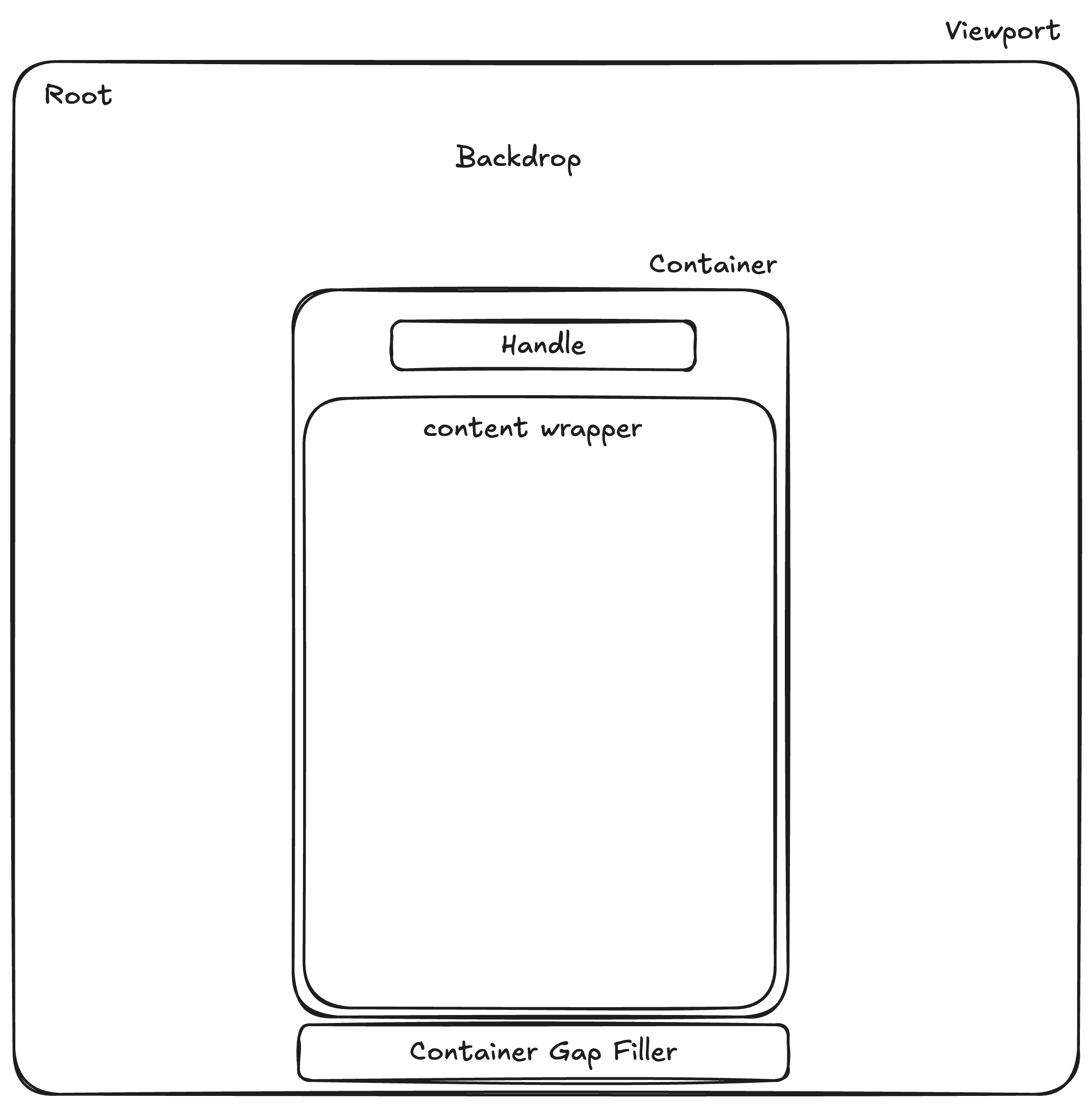
- root: the root element.
- backdrop: a backdrop covers the rest of the element except the container.
- container: a container for a handle and a content.
- handle: a dragging handle bar.
- content wrapper : an element that wraps your content(
childrenprop of theBottomSheet).
- container gap filler: an element that covers the space between the container and the bottom of the screen when the container is dragged up.
Root
-
rootStyle?: CSSStyleDeclaration
Optional. Styles the root. -
rootClass?: string | null
Optional. A custom class name.
Dragging Handle
-
handleStyle?: CSSStyleDeclaration
Optional. Styles the handle. -
handleClass?: string | null
Optional. A Custom class name. -
shouldShowHandle?: boolean
Optional. Determines if a handle should be shown.
Backdrop
-
backdropStyle?: CSSStyleDeclaration
Optional. Styles the backdrop. -
backdropClass?: string | null
Optional. A custom class. -
shouldShowBackdrop?: boolean
Optional. Whether to show the backdrop or not. -
backdropColor?: string | null
Optional. The color of the backdrop. -
backDropTransition?: string | null
Optional. The CSS transition for the backdrop appearance animation.
Container
-
containerStyle?: CSSStyleDeclaration
Optional. Styles the container. -
containerClass?: string | null
Optional. A custom class. -
containerBackgroundColor?: string | null
Optional. The background color of the container and the gap filler. -
containerBorderRadius?: CSSUnit | null
Optional. -
width?: string
Optional. The width of the bottom sheet. Defaults to 100%. -
marginTop?: number
Optional. Space between the top of the bottom sheet and the viewport’s top.
Defaults to20.
ContainerGapFiller
containerGapFillerStyle?: CSSStyleDeclaration
Optional. Styles the container gap filler.
Content Wrapper
-
contentWrapperStyle?: CSSStyleDeclaration
Optional. Styles the content wrapper. -
contentWrapperClass?: string | null
Optional. A custom class.